Monday, 19 March 2012

New Order to Wim Crouwel

Looking through the Factory Records Graphic Album, 
http://www.amazon.co.uk/Factory-Records-Complete-Graphic-Album/dp/0500286361 


I found this 


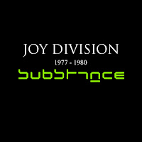
These are the sleeves for New Order - Substance. Peter Saville designed these using Wim Crouwel's New alphabet


Wim Crouwel never designed this typefact to be readable, but as a need for typefaces to be viewed on early computer screens and  phototypesetting equipment.

I find it very interesting that at the time the style was modern and looking forward to the future but now as styles have moved on its seen as retro-futurism

I also found a great interview with Crouwel here


New Order to Fortunato Depero

While doing research and looking for inspiration for my self initiated brief, i was looking through this book 
Factory records the complete graphic album. (its great BTW)

I saw these Cd sleeves for New order procession, I like the clean technological feel and the different colour prints, which is something I consider doing

I read that this was influenced by Fortunato Depero, an Italian from the futurist movement
 
Peter Saville was influenced by Depero's design and made it into his factory records logo ; where he has added work tools associated with the Factory theme

I then went on to look at more work by Fortunato Depero, where I found out he was a painter, stage designer and graphic designer and part of the Italian futurist movement.  The Futurists had a great love of speed, technology, war, and violence. They loved technological triumphs of humanity, like cars, planes, and the industrial town, over nature.
Here's some more of his work
 

I also found it interesting that he did the packaging design for Campari Soda, which is still in use today